I'm a traditionalist. I miss the Chicago maroon
|
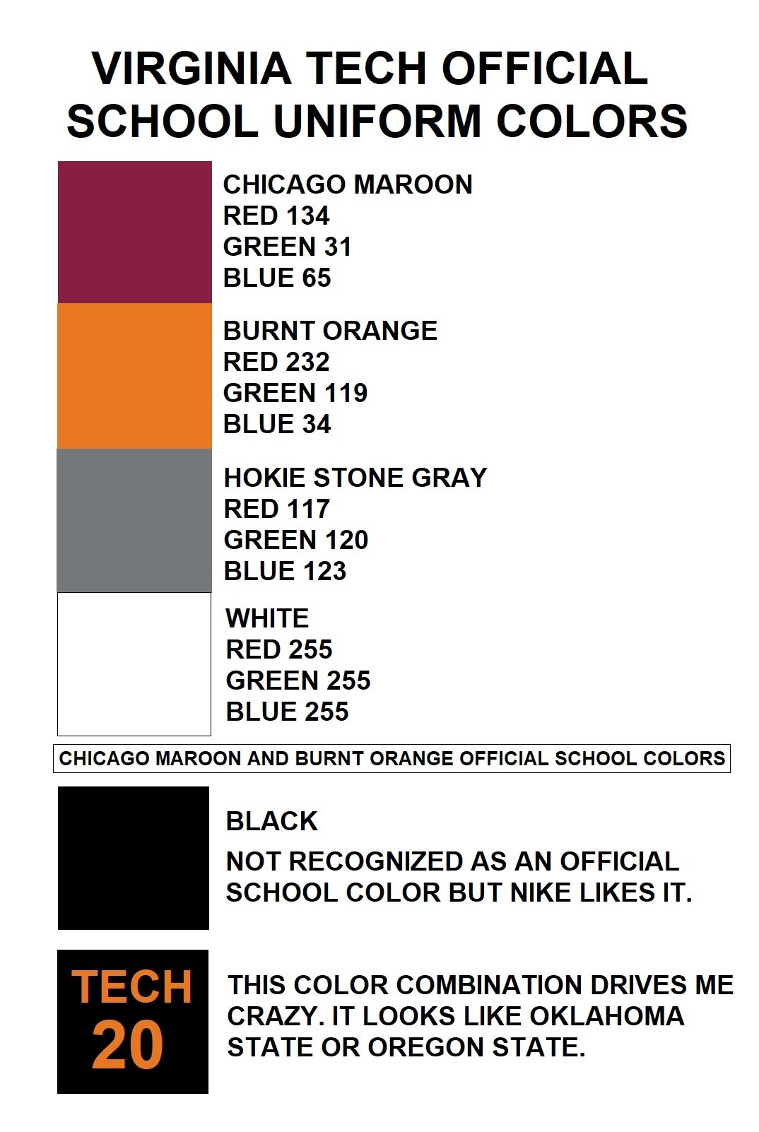
It has seemed to be replaced by black since Whit Babcock got here. When Babcock took over as AD I remember him saying Tech would get back to their true colors (which meant CHICAGO MAROON, not maroon or deep red and BURNT ORANGE, not orange or light orange). He also said Tech would try to find a font that would be recognizable at all times. I understand that many (especially the kids) today like the black and find it cool, badass, or "modern" but I miss the recognizable Chicago maroon. I've watched some women's basketball and women's soccer games the past year and thought I was watching Oklahoma State or Oregon State with their black and orange uniforms. I'd love to see Chicago maroon and burnt orange more often since they are the official school colors. I realize some find that color combination hideous but I find it beautiful in a Hokie kind of way. That unusual color combination identifies Virginia Tech. The only change that I have embraced has been the Hokie Stone pattern uniforms (minus those hideous Hokie Stone football helmets). Those uniforms identify VPI&SU. I'd love to see some of our uniforms simply have "TECH" on the front of them like Georgia Tech has. Now get off my lawn and turn down that loud crap you call music!
[Post edited by Old Line Hokie at 02/21/2020 4:55PM]
|
(
In response to this post by Hokster)
Posted: 02/21/2020 at 4:54PM


 I'm a traditionalist. I miss the Chicago maroon -- Old Line Hokie 02/21/2020 4:54PM